


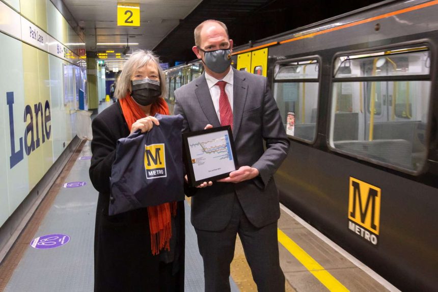
Contemporary typographer and graphic designer Margaret Calvert, creator of Tyne and Wear Metro's well-known logo, visited the network 40 years after creating its iconic branding
Calvert's work in collaboration with graphic designer Jock Kinneir has come to shape Britain's modern visual identity, defining our roads with their iconic road signage system. Calvert also worked with British Rail and British Airports Authorities and her work is still in use at railway stations, and airports today looking timeless and modern.
Calverts work with Tyne and Wear Metro which opened in 1980 saw her use her own font for the signing system to provide a logo with a strong identity bringing an instantly recognisable symbol for the network which has been used in the form of external and internal signage including the large yellow Metro M cube outside stations and giant wall graphics for underground platforms.
Margaret Calvert's amazing career has seen more than six decades of innovative design work and she took the chance to visit her work on the Tyne & Wear Metro network as she was in the region to collect an honorary degree from the University of Sunderland.
Nexus, who own and run the Tyne & Metro, were honoured to welcome Mrs Calvert, whose iconic typeface will feature prominently on the new £362m fleet of trains which are currently being designed and built and will see service for the next 30 years.
Customer Services Director at Nexus, Huw Lewis, said:
“It was an incredible honour for us to welcome Margaret Calvert, the woman who has got more to do with the look and feel of the Tyne and Wear Metro than perhaps anybody else.
“The visual identity Margaret created through her distinctive font design is truly iconic – it is as timeless as that of the London Underground and embodies the unique pride our region has for Metro as it celebrates its 40th anniversary.
“When Metro was built local politicians and planners wanted it to have a whole new feel to set it apart as a modern urban transit system like nothing seen before in Britain. Margaret Calvert's work on the visual identity helped achieve that.
“The Calvert font has a sturdy character to it which reflects the character of North East England. I think that's why it has more than stood the test of time to help make Metro part of everyday life.
“Margaret was in the region to receive an honorary degree from Sunderland University. This is the least that she deserves for the work she did right back at the start of Metro, which we are celebrating as we celebrate our 40th anniversary.
“She created an icon. An icon for Metro, and an icon for North East England. We owe her a great deal of thanks.”
Where Next on RailAdvent?
Railway News
DVDs, Prints, Cards and Gifts
MAINLINE STEAM INFO
Competition Time!
Share your pictures
FREE NEWSLETTERS
Subscribe for More


